Big Update On Obama’s Ugly Presidential Library – He Should Be ASHAMED See less…
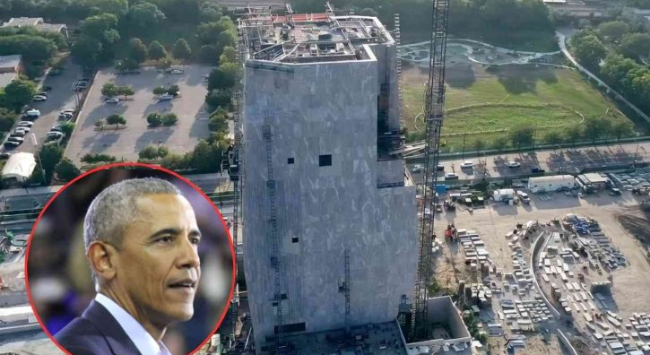
As many of our readers know, the truly ugly Obama Presidential Center is supposed to open next month. Barack Obama put out some videos with Star Wars actor Mark Hamill on May 4th to try to hype his library, which makes sense, given all the memes online comparing the design of the library to various objects and vehicles featured in the Star Wars movies. However, it was a disappointing effort that fell flat and drew a ton of mockery.
One of these is the Obama Library and the other is a North Korean guard tower. pic.twitter.com/ealD53Fpgl
— Scott Adams (@ScottAdamsSays) October 19, 2025
If you don’t see that when you look at it, don’t worry; no one else does either. The exterior features words from one of Obama’s speeches, but they’re displayed so poorly that it’s difficult to read them, which reflects poorly on Obama himself.I still think it looks like a Star Wars droid. pic.twitter.com/WptnUGlxvd
— James Madison (@FoundersTruth) October 19, 2025
Interestingly, he was very involved in the design process, which may explain the building’s unappealing appearance. The designers confirmed the extent of his involvement:It was designed for Obama by Billie Tsien and Tod Williams, who recently revealed the design “very much a product of his vision as well as ours” after the former president repeatedly pressed them to make the design as “bold” as possible.But as hideous as the building itself is, some of the merch they’re going to hawk to the public is even goofier:Williams said, “He drew on one of my drawings, made a strong mark, which indicated that he didn’t think I was being bold enough.” [….]
The building is meant to symbolize four hands coming together in unity
“He wanted us to do something that we had not done before, and that is hard,” Williams said. “He didn’t let it rest.”
How much for this gray blob? Be ready to fork over $30. Not even kidding.Omg I thought this was parody.
— Mark (@rhapsodyboard1) May 5, 2026
"Designed by Obama leader" 🤣https://t.co/0pBWEBraYd pic.twitter.com/1ucXzZp5w6
Many weren’t impressed with the pricey pins — with some comparing them to chewing gum, pregnancy tests and blobs of toothpaste.“It looks like chewed gum or an eraser that a third grader has been mutilating,” one user on X wrote.Obama’s Center has become a symbol of failure. It has taken over ten years to develop, faced local protests, and its costs have soared from the original estimate of $500 million to $850 million. The design, often referred to as the “gray blob,” perfectly encapsulates this sense of failure.“How is that even uglier than the actual building?” said another.
“The pin represents the intersection of bold design and global leadership,” the website reads, noting the proceeds go to the Obama Foundation “to inspire, empower and connect people to change their world.”
“I thought the building was ugly, then I see the pin,” wrote a third.